 3rd Prize.
This is another skilful, simple and effective design. The case was entirely made of cardboard, which folded out with pasted pictures, and was held closed by a tiny metal clip. The theme in the artwork was also well executed. From what I recall, all of the pictures included were in the same element as the cover. A sort of propaganda like, golden age Americana idea, with an early technology or a science fiction sort of angle. Classic.
 4th Prize.
A picture doesn’t do this work it’s full justice unfortunately. This was another sort of cardboard creation that had been decorated over very well. It seriously looked like a finished product of an album that you would buy in a store. I’m not positive as to what the over all theme was, but it did include some sort of ‘social equation’ on the back. Something in reference to music nerds, or emotion in relation to music. I honestly can’t recall exactly, but I do remember being really impressed, and thus why it placed.
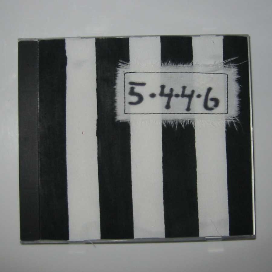 5th Prize.
This was our final of five placements, although admittedly it was quite tough to choose, as we did receive a ton that would have also deserved to claim this very spot. I didn’t get a detailed look at this work aside from its decoration, which was a kind of fabric tape over the cover. Whenever I look at it now, it seems as if it would be a prison theme. That, or possibly Beetlejuice? Either way, this is another straightforward and successful design.
1 comment:
Sweet. Great theme, I was curious about that.
If you have the time and patience please post a track listing.
Post a Comment